
Sunday, December 11, 2011
poster campaign
this is part of a poster campaign created by Wing for the 2011 new york international latino film festival. the campaign is designed to bring awareness to the stereotyping as well as shortage of latinos in mainstream hollywood films. this particular poster shows the occupations of latinas in movies, indicating that the majority are cast as maids. source: gd usa, september 2011.

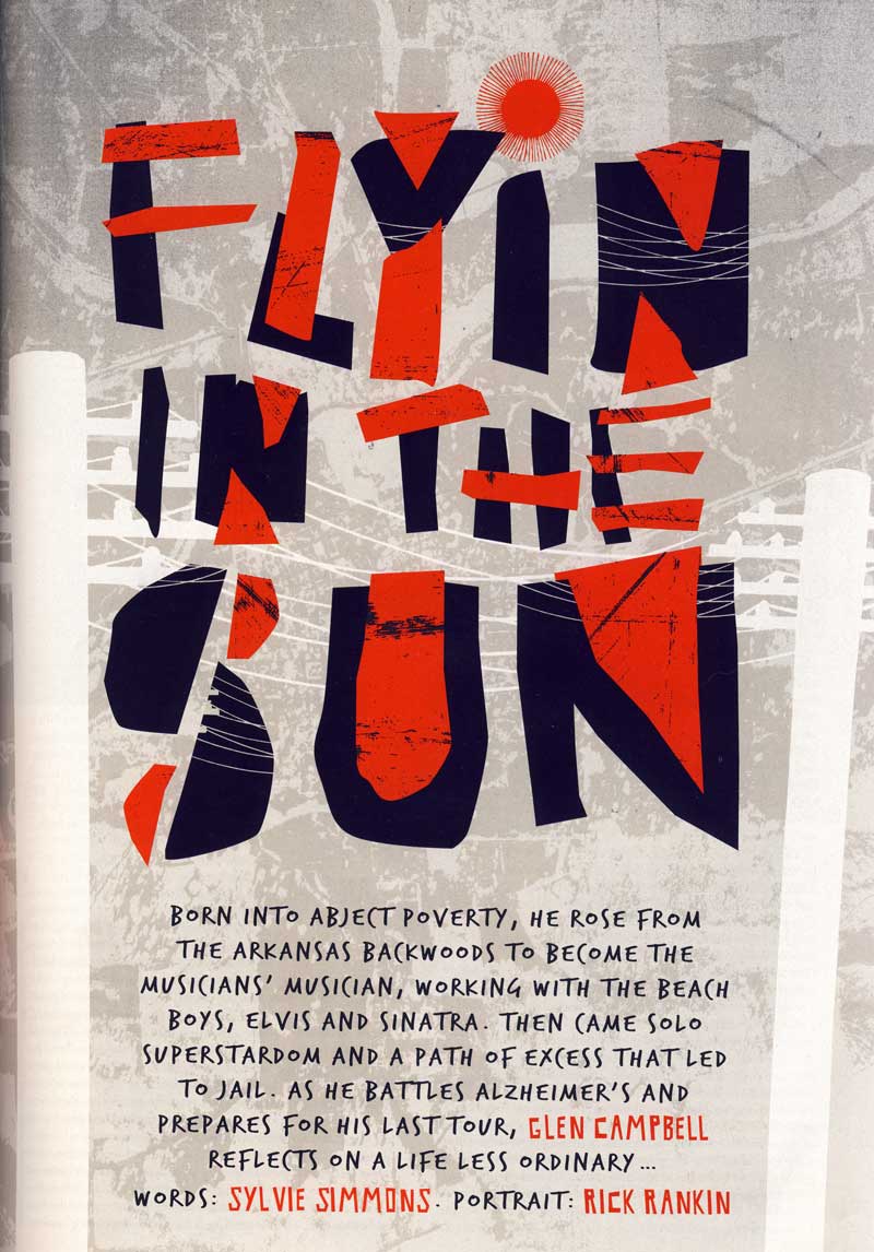
mojo editorial design #3
rounding out this semester's worth of mojo magazines (december 2011), this collection of editorial design once again impresses. it must be a lot of fun to design editorial layouts based on bands!


logo design
designed by tom kirsch at GSD&M for king pin bowling in austin, tx, this logo is deceptively simple—and absolutely perfect. source: print design annual, november/december 2004.


poster design
i can't seem to go a semester without posting design by one of the two garys—baseman & taxali. here are a couple poster designs from the former, for Yee-Haw Industries in knoxville, tn. Source: print design annual, november/december 2004.


book cover design
as someone who's worked as a copyeditor and proofreader, i can appreciate this. designed by Louise Fili, Ltd., in nyc. source: print design annual, november/december 2004.


more awesome typography
from the june/july 2011 issue of bust. this is the headline of an article about florence welch (of florence + the machine). i'm continually amazed at designers' creativity when it comes to lettering and typography.


cool, lo-fi package design
i saw this in the june/july 2011 issue of Bust. it's a picnic set by boxsal, and includes large & small bowls, utensils, cups, napkins, a trash bag and trays. i love the box!


black and white
as a less-experienced designer, sometimes i feel odd just using black and white in a design. it's necessary, especially when a client's budget is low, but i often think, "am i slacking off for using just black and white? will the design look incomplete?" i've come to realize, however, that black and white can present constraints that force you to be more creative, than simply relying on color to make the design look good. it also implies a certain sophistication, as evidenced in this stationery/id set for EightHourDay, a two-person firm based in minneapolis. (source: HOW, may 2010)


same concept, different interpretations
this is an advertisement for gerald & cullen rapp, a firm representing illustrators, that appeared in the communication arts design annual in 2010. it's a really cool example of how different people can interpret the same idea, in this case two men staring at one another (i'm assuming they represent the rapp brothers).


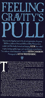
mojo editorial design #1
i'm always excited to see a new issue of mojo in mailbox every month. it's the most informative rock magazine out there. my only complaint is they have the same bands—pink floyd, the beatles, and the who—on the cover every single month. seriously. how much more can we know about them? but i digress. the mag's layouts are fun, and the editorial design is top-notch. here are a few type treatment examples from the october 2011 issue.


(whoa. that amy winehouse layout uses a free font, bifur.)


(whoa. that amy winehouse layout uses a free font, bifur.)
Subscribe to:
Posts (Atom)
